Football
Ranking the Historic Gallagher-Iba Arena Floors from 1-8
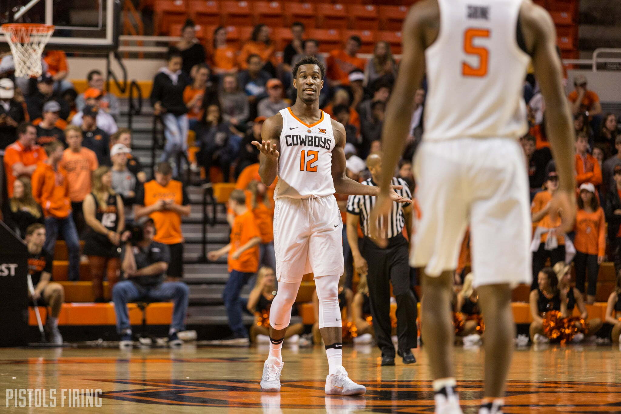
With a new basketball season on deck starting tomorrow, it’s time for a very important piece of #journalism. Let’s rank the historical GIA courts.
From worst to best.
I’m stealing this concept from myself from a few years ago. Not much has changed since my original rankings. GIA is on its 13th iteration in the last 55+ years, although only eight have been super noteworthy.
It should be noted that there were some super subtle changes in certain years (like the addition of the Big 12 logo in 1996). I ranked the eight basic versions rather than all 13. Apologies for the blurry screenshots.
Let’s go.
No. 8 — The Fade
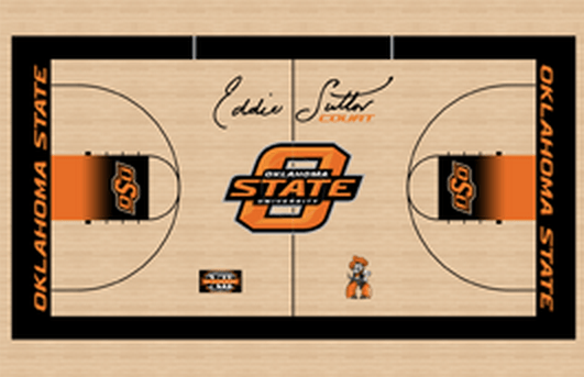
So much going on, and none of it is good. Literally everything that has changed about this floor to the current floor is better. Smaller Eddie, better Big 12, see-through Pete and those black-to-orange lanes ?
7. The 2000-05 version
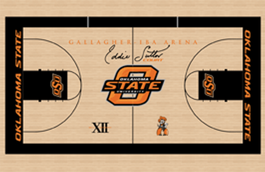
It’s the same as No. 8 but without the faded lanes. Still not great, but I would happily go back to this if it meant we got 2000-05 quality of basketball.
6. The 2008-14 version
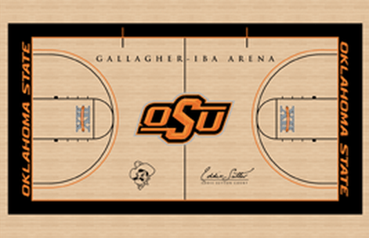
A little like Travis Ford: Should have been better than it was but didn’t really meet the moment. A good floor, not a great floor.
5. The current version
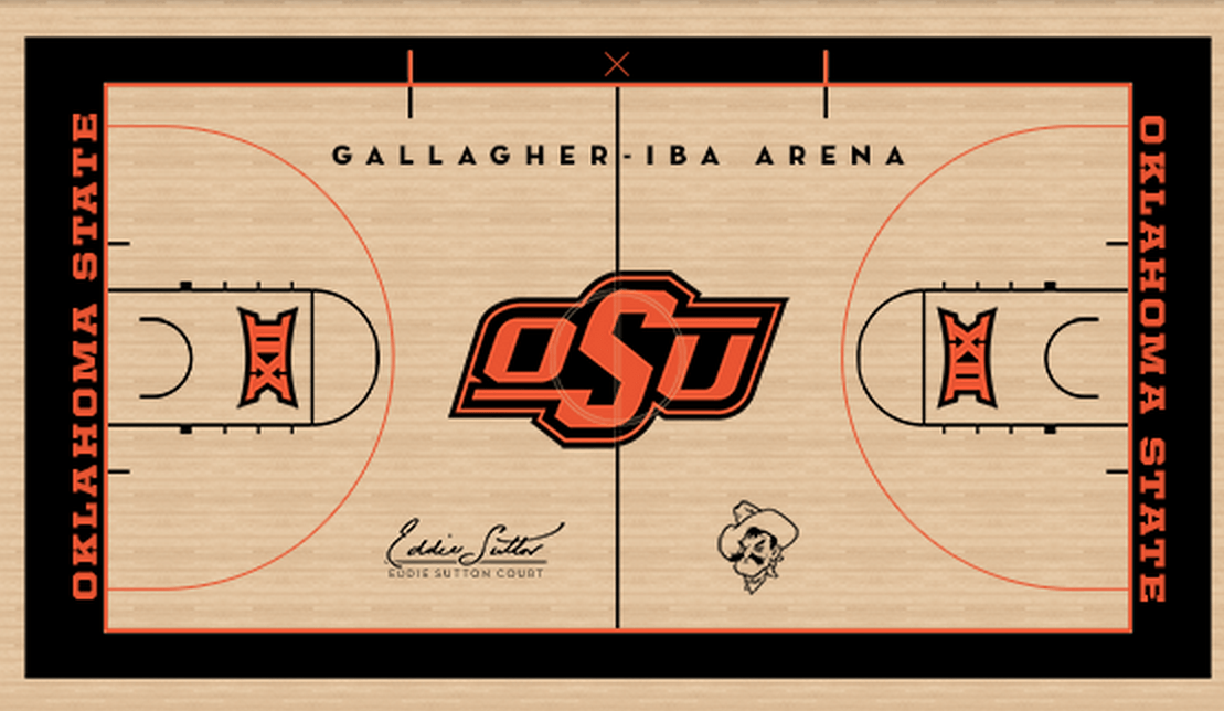
The main improvement from the previous floor is on the baseline. They finally got OSU out of that gross, Les Miles-era slanted print. Also, everything is just crisper. The orange is better. The logo looks more like it should.
4. The late 1980s and early 1990s version
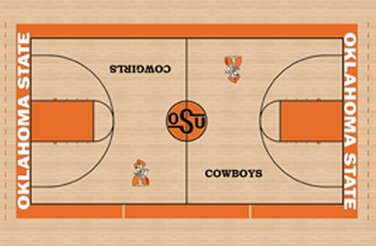
Goodness I love this court. The subtle Cowboys/Cowgirls shift. The old school logo in the middle of the court. The orange lanes. It’s such a throwback.
3. The 1993-2000 version
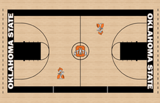
The O-State is maybe the most underrated logo in school history. Everybody remembers the Barry-era OSU logo, but this one gets a little lost. How many threes did Randy Rutherford hit from those Petes?
2. The 1957 version
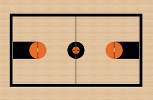
The circle at the middle of the court really does it for me. The A on one side and the M on the other. Why don’t more teams go back to stuff like this? In a world rife with Maryland football helmets, why does minimalism not reign when it comes to design? The Penn State football uniforms of basketball floors.
1. The early 1980s version
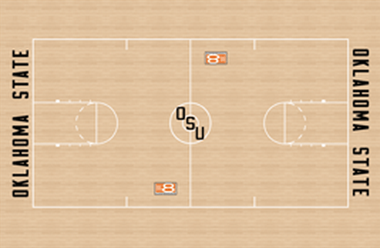
The 2015 Homecoming helmet logo at midcourt. The Big 8 logo. The blocky Oklahoma State on the baselines. No colors, just white maple. It’s beautiful. Would go back. Would subscribe. Might trade Darrion Daniels to OU to have this court back.
The Cowboys open against Pepperdine tomorrow night. They are 96-12 (.889) all-time in home openers and have won 41 straight home-openers in GIA dating back to 1974-75.

-

 Softball2 days ago
Kenny Gajewski Lights Up Big 12 for Naming Co-Pitchers of the Year
-
 Football3 days ago
Oklahoma State Drops Home-and-Home With Alabama, Adds Home-and-Home With Michigan State
-
 Softball4 days ago
‘She’s Just A Dog’: Returning from Injury, Redshirt Freshman Madison Hoffman Has Provided the Cowgirl Offense with a Pinch-Hitting Spark
-
 Wrestling5 days ago
David Taylor Reveals that Dean Hamiti ‘Likely’ Won 2025 NCAA Title on Torn ACL


