
Football
Uni Roundtable: Our favorite NFL threads
Who won the Texas-OSU matchup and who’s doing next-level things at the next level?
The Uni Roundtable is a tad late this week — I honestly forgot about it with all the Gundy2Gainesville hubbub at the beginning of the week — but hopefully as enjoyable as ever.
Let’s get on with it.
Porter: First things first, who won the OSU-UT uni matchup?
Southwell: OSU easily won even with a repeat combo. I like that Texas mixed it up with the metallic logo, and their all white looks alright.
If we keep this streak of scoring less than 20 points, we might revert back to W-O-W and W-W-O only.
(elderly alumni initially approve then realize that’s not a good thing).
And what was the deal with Phantom Fiber?[1. Carbon Fiber Resurrection. Zombie Fiber. I’m having too much fun making up names for a helmet that might not be real. Until then, RIP Carbon Fiber.] Can we expect to see it this weekend or did we get trolled by the equipment staff?
Cunningham: I was happy I snuffed out the Carbon Pete bluff. Tweeting that out on a Wednesday was just too weird.
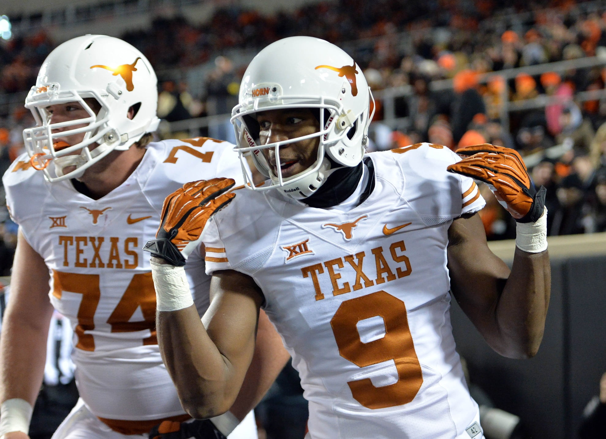
As for Texas, I was in the press box. And this was my reaction when I noticed something different about the Longhorns’ helmets…
When your uniform is as classic as UT’s you don’t need to do much. This was a subtle, fantastic addition.
Kyle made a great point about UT’s uniforms earlier in the season: They are less “practice jersey-ish” than they used to be. And he’s right, they were better that way.
It’s odd to say that, but it’s true. (How nasty was UT Roy Williams, by the way? Definitely a first ballot Uni Hall of Famer)
As for OSU, they just couldn’t help themselves with the superstition. They beat Texas Tech in this combo so they tried it again. It’s a great look (one of their absolute best) but why do a repeat?
I was disappointed. Black-Gray-Black is my white wale. It will never be captured.
Porter: I’m sure Herman Melville had OSU’s uniform options in mind when he penned the adventures of Cap’n Ahab in 1851.
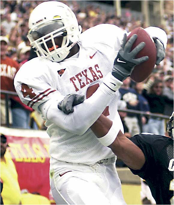
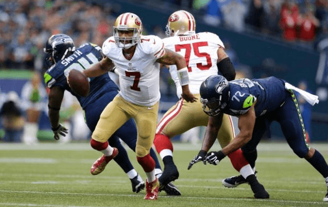
I pretty much always think Texas wins its road uni matchups and this week was no different. OSU’s chrome-black-black is immense but not much can touch Texas’ whites in my book. I thought the chrome-y Horns logo was a good look.
I actually saw a lot of people hating on it but I was pleasantly surprised. It was melded as well as you can meld new and old school. Of course I’m more biased towards Texas’ unis than Travis Ford is towards Michael Cobbins so take everything I say with a fistful of Morton’s stock.
We’re going to switch gears briefly and I want you to give me your top three NFL uni looks (alternates are acceptable). I know Carson and I are zeroed in on the same squad for this one.
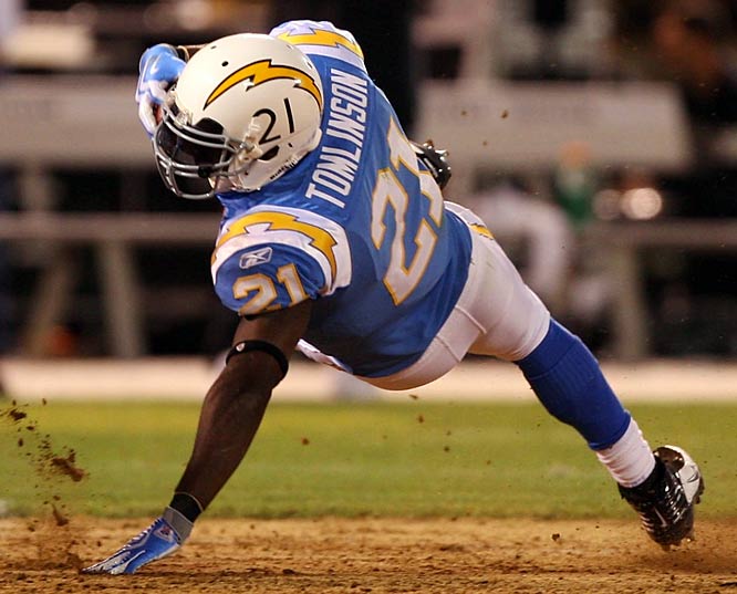
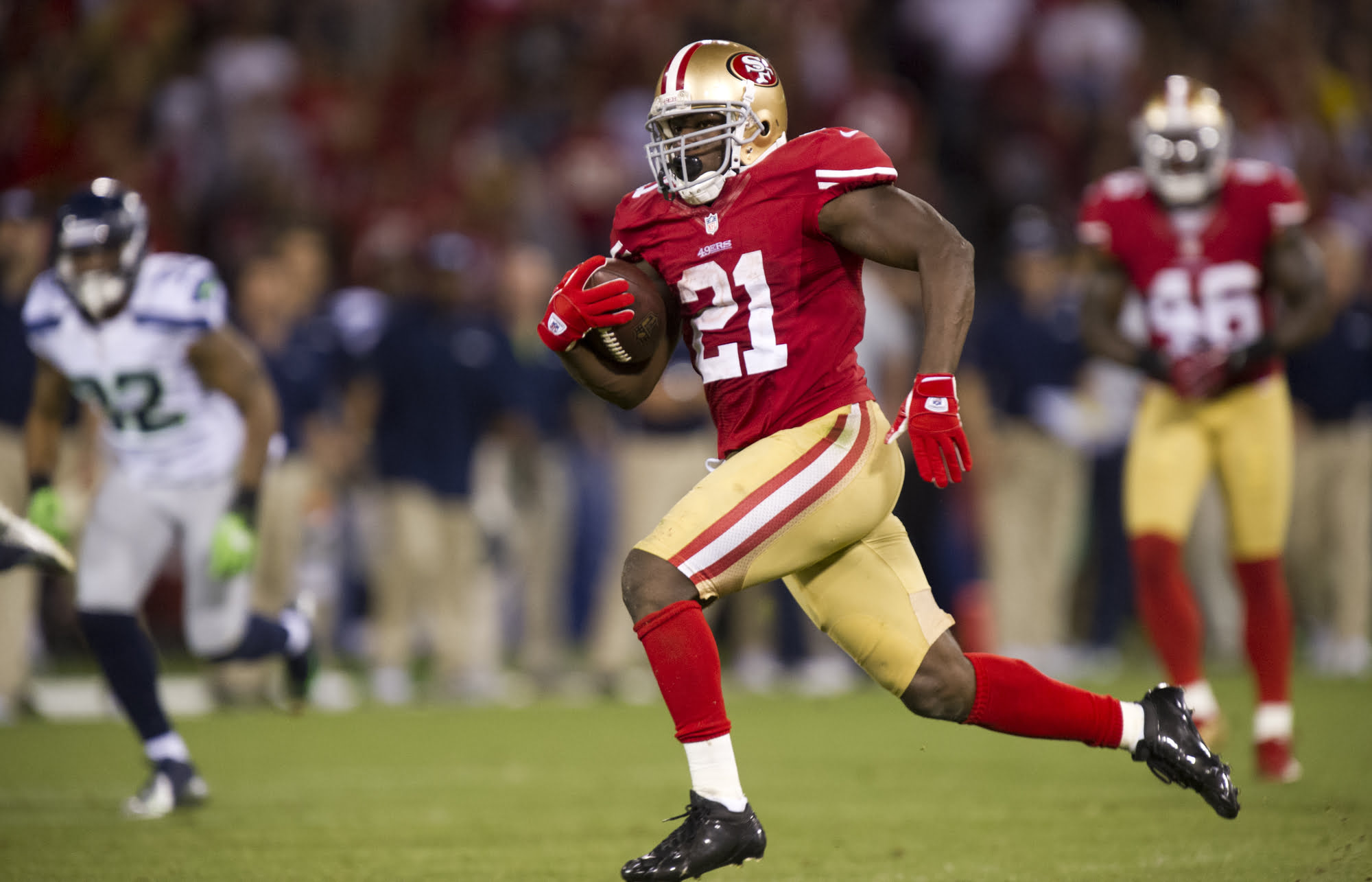
Southwell: 1. San Diego Chargers Powder Blue 2. San Francisco 49ers (prefer away) 3. Dallas Cowboys (white)
Cunningham: 1. San Diego (Powder Blue) – It’s a crime. Repeat, a CRIME they don’t wear these every home game. I’m not as big of a fan of the updated version:
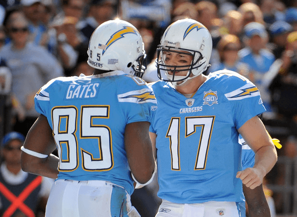
But the throwback version is the best uniform in any sport:
2. San Francisco (Home) – Thank goodness they went back to their traditional uniforms. These things are simply stunning when they come on the HD broadcast.
3. Chicago (Home) – This was a tough call (love what Buffalo is doing these days, Raiders are still great) but the tradition and mean-ness of the Bears homes makes my top three..
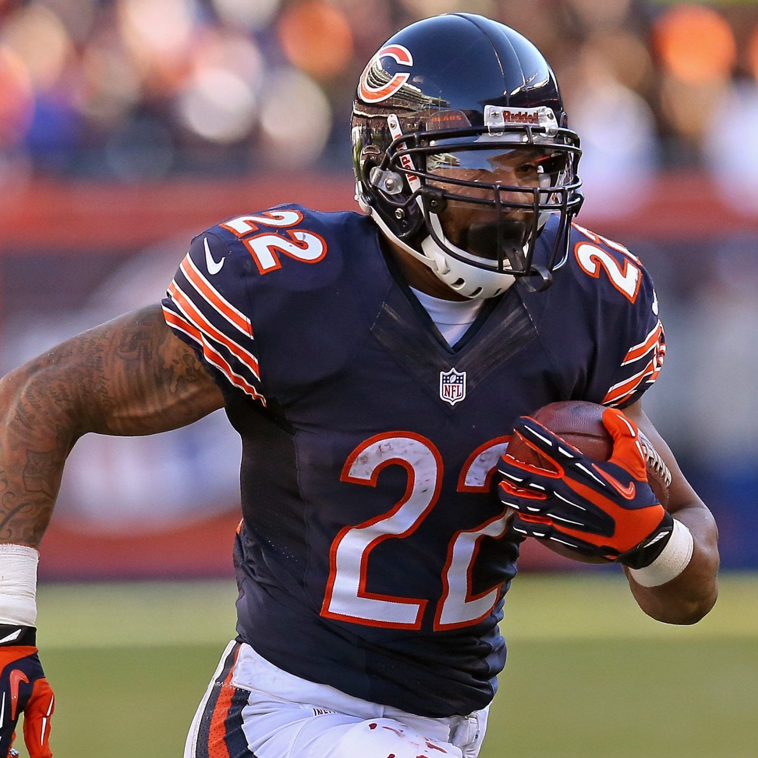
Kyle mentioned last week Georgia’s red is different than everyone else’s red. Same goes for Chicago’s Navy. I love the GSH on the sleeves (George Halas’ initials), the letter C on the helmet, the stripes, the numerals.
All of it is great.
Southwell: I put Dallas in as my No. 3, but my gosh it’s tough to beat the Bears. Great list, Carson. I really like their throwbacks with the orange numbers, no outline. I wish they would wear their helmet logo with those.
Those sleeves and socks are iconic.
My bias for the Cowboys could be blurring my vision; I’m starting to think that the Bears are a true top three pick.
By the way, what do you guys think about this Baylor blackout promotion? Why do you think OSU hasn’t done it yet?
Cunningham: Funeral for Oklahoma State football? Mourning RG3’s time in Washington?
I remember OSU tried an official blackout for the 2009 Texas game. It went poorly and Texas won 41-14. I’ve never like contrived blackouts. It just seems…high school-ish.
If everyone organically and uniformly decides to unite it can be glorious. No promotion special t-shirts or anything is needed.
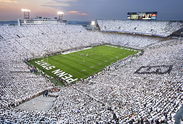
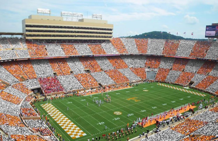
Porter: Yeah I’m with Carson — not a fan of the promoted color schemes unless you’re going to go all-time like this:
This is going to put Tennessee's checkerboard to shame if it's is executed right! #Mizzou #TigerStripeFaurot #SEC pic.twitter.com/aC3trtXD4O
— Kaylee Glyder (@KayleeGlyder) October 9, 2014
Otherwise it feels hack-y — like stuff bad teams do to get people to come to games (which, I guess…)
As for my top three NFL unis…I’m going:
1. 49ers away — They’re perfect. Niners gold = Georgia red = Bears navy and the white and red are the perfect accent.
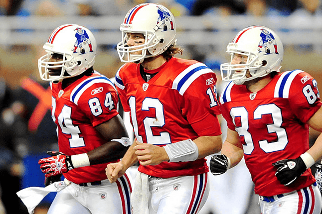
2. Pats throwbacks — Everything you want in a throwback. Simple, great logo, color scheme rocks. Brady’s hair (wait..)
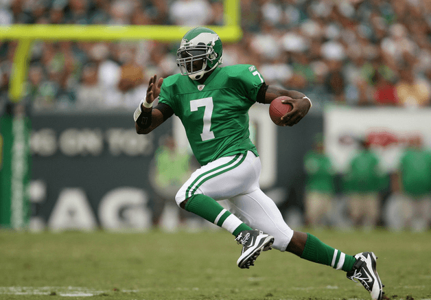
3. Eagles throwbacks — Sort of convinced this is why Chip Kelly took the job.
Southwell: We’re in some disagreement here. Tennessee’s checkerboard was pretty legit and OU’s candy cane look is one of the only cool things OU does.
Georgia had the intimidation factor with their blackout.
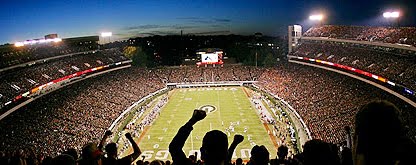
I get that OSU wants to keep the Sea of Orange, but when it’s cold enough, people are wearing black coats over their orange shirts. Pretty much a blackout.
It’s like Thunder Playoffs on a bigger scale. Not necessarily for bad teams. It looks great when it’s done right.
Cunningham: Eh, looks cool for the Goodyear Blimp, I guess.
I was really disappointed in Miami. This game was a chance to finally make the FSU-Miami rivalry relevant again. And while I understand wearing new uniforms for a primetime, national broadcast… this looked nothing like Miami.
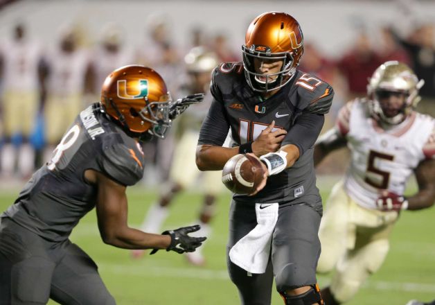
The dark gray with the orange (copperish) helmets just didn’t work. It was pretty gross, actually. Not to mention it was an affront to years gone by.
FSU did their part with the traditional gold-white-gold. The U should’ve worn white-orange-white. No need to mess with a traditional, powerful look.[1. When I was in high school, a majority of the football teams in Oklahoma copied Miami’s 2001 uniforms. Everyone HAD to have them. They were that cool at the time.]


Chasing Gundy: Eric Morris Praises Former Oklahoma State Head Coach at Big 12 Media Days

Where Drew Grew: How Mestemaker Developed as a QB This Offseason

Eric Morris Shouts Out Some Defensive Standouts at Big 12 Media Days

How Eric Morris Supported Joey McGuire Throughout Brendan Sorsby Situation

Caleb Hawkins Bigger, Strong, Faster Entering Sophomore Season

Daily Bullets (July 12): Several Cowboys Await Day 2 of MLB Draft

OSU Baseball: San Diego Padres Draft Alex Conover in Round 4

Daily Bullets (July 11): Coach Mike Earns (Another) Big Break

Former Oklahoma State Coach Mike Boynton Inks Two-Year Deal with Michigan

Eric Morris Took Early Steps to ‘Squash’ Natural Divisions within OSU’s Locker Room
-
 Football5 days ago
Chasing Gundy: Eric Morris Praises Former Oklahoma State Head Coach at Big 12 Media Days
-
 Football5 days ago
Where Drew Grew: How Mestemaker Developed as a QB This Offseason
-
 Football5 days ago
Eric Morris Shouts Out Some Defensive Standouts at Big 12 Media Days
-
 Football5 days ago
How Eric Morris Supported Joey McGuire Throughout Brendan Sorsby Situation