
Uniforms
Uniform Review: Barbed Wire Helmet Is Highly Polarizing
I will be grading OSU’s uniforms each week using a criteria consisting of five categories.
Four of the five categories are on a scale of 1-5. The helmet will have its own rating. Aesthetics will be a rating of the flow of the uniform as a whole. The intimidation factor will simply be how intimidating the uniform looks. The accessories will be a rating of the gloves, socks, shoes, and sleeves. Additionally, the Cowboys get a point for winning. A perfect score is 21 points for the GOAT.
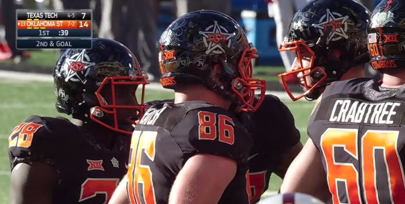
Helmet (4)
We have just been introduced to the most polarizing helmet in Oklahoma State history. For all of the opinions loving or hating it, I find myself pretty much in the middle. It’s not my favorite, nor is it my least favorite. With a design that has so much going on, it’s up for extreme scrutiny.
When the uniforms were released, everyone talked about the possibilities of a bandana pattern on the helmet. The more I look at it, the more I wonder why we’re wearing a bandana pattern on our lids when it could have just been left alone on the collar of the jerseys. Still, this design needed to be done and I think the final product was as good as we could have imagined.
Very cool helmets for Senior Day!! #osufbequipmentcrew pic.twitter.com/Em8Gjt3JvA
— Robert Allen (@RAllenGoPokes) November 12, 2016
One can appreciate how the pattern was strategically placed on the helmet instead of randomly thrown together. The Boone Pickens Stadium element looked especially great on the back and I admired the retired jersey numbers in the design.
A close look at the detail of the @CowboyFB alternate helmets #uniswag pic.twitter.com/sIXdKRWLVP
— UNISWAG (@UNISWAG) November 12, 2016
My only objection to any component of the helmet was the orange barbed wire because it was too distracting. The barbed wire is also in gray and blends in nicely with the bandana print on the rest of the helmet. I just don’t see the need for a faux barbed wire stripe down the center of the helmet when it inadvertently takes away from the rest of the design.
The marshal badge is undoubtedly the best logo to serve as the focal point for this helmet. That being said, I’m really starting to miss the regular brand logo.
The helmet design itself is flashy, so I think it’s great that they decided to use a glossy black helmet as opposed to using the matte finish. I’m not sure that a black or chrome facemask would have looked any better than the orange facemask on this helmet. The helmet design was loud and it deserved a loud facemask.
Aesthetics (5)
The orange facemask might not have been the best element to this particular helmet, but it worked with the uniform combination as a whole. The orange jersey numbers are alone without it. It didn’t seem that way in the past because of the accents of orange in the barbed wire stripes. Regardless, if you wear all black it’s going to look great.
Intimidation (5)
We were able to get an idea of what the reflective outline on the numbers would look like in a night game when the stadium lights were turned on. As the game went on and the sky grew darker, the uniforms looked tougher.
Accessories (5)
The socks had the bandana pattern as well. Thankfully they didn’t have an orange barbed wire streaming across the design.
Win (1)
The edge of my seat is worn out. I’m hoping we can have at least one more game that embodies a James Washington deep ball where we get out to a big lead and never get caught from behind. At least my overworked heart can celebrate the victories. Thank you, seniors.


Four-Star In-State Target Israel Hammons to Announce College Decision Friday

Three-Star Safety Chayce Davis Commits to Oklahoma State

Oklahoma State a Finalist for Offensive Line Prospect Tristan Hardin-Roberts

OSU Softball: Mississippi State Transfer Pitcher Delainey Everett Commits to Oklahoma State

U.S. Open Preview: The Cowboys Will Be Well Represented at Shinnecock Hills

Daily Bullets (June 21): Cowboys Land a Pair of Power Four Pitchers

OSU Baseball: Cowboys Land Washington Pitcher Noah Kenney, Texas Tech Transfer Will Jordan

Wyatt Hendrickson Makes United States World Team

Daily Bullets (June 20): Eric Morris Reels in a Four-Star, Doug Gottlieb Extended

WATCH: Eric Morris Puts Three Oklahoma State Walk-Ons On Scholarship
-
 Football4 days ago
Four-Star In-State Target Israel Hammons to Announce College Decision Friday
-
 Football5 days ago
Three-Star Safety Chayce Davis Commits to Oklahoma State
-
 Football5 days ago
Oklahoma State a Finalist for Offensive Line Prospect Tristan Hardin-Roberts
-
 Softball2 days ago
OSU Softball: Mississippi State Transfer Pitcher Delainey Everett Commits to Oklahoma State