
Uniforms
Uniform Review: Solid ‘B’ For Pokes In Manhattan
I will be grading OSU’s uniforms each week using a criteria consisting of five categories.
Four of the five categories are on a scale of 1-5. The helmet will have its own rating. Aesthetics will be a rating of the flow of the uniform as a whole. The intimidation factor will simply be how intimidating the uniform looks.
The accessories will be a rating of the gloves, socks, shoes, and sleeves. Additionally, the Cowboys get a point for winning. A perfect score is 21 points for the GOAT.
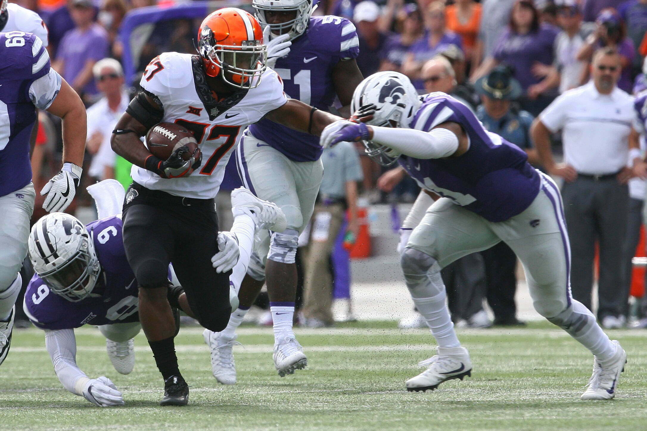
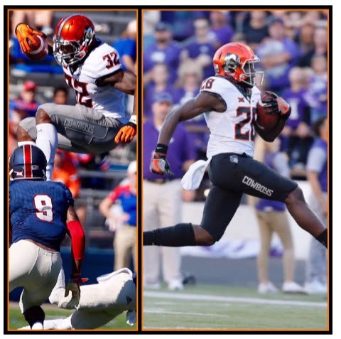
Helmet (4)
I’m surprised to see this helmet again, but I think it looks good with this combination.
Aesthetics (5)
This isn’t my favorite tri-color look, but it definitely looks better with the black numbers. Choosing black over the gray pants makes a huge difference for this combo.
via @sarahcphipps
Intimidation (4)
This is a good look that contrasts well against Kansas State. I think we’re ready for some variation on the helmet decal. I saw a few comments from some fans that they thought it looked like a Cleveland Browns combo. The Browns wish.
Accessories (4)
The accessories were pretty basic, which is perfectly fine. I thought we would see black socks with orange accents because of the orange chrome helmet, but they sported the black socks with gray accents instead.
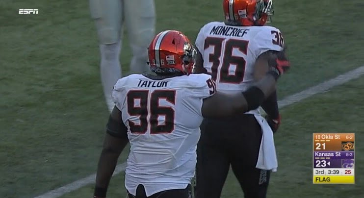
Win (1)
My pulse is back to normal about 24 hours after the final whistle. Now it seems the Pokes control their own destiny on their way to a Big 12 title.


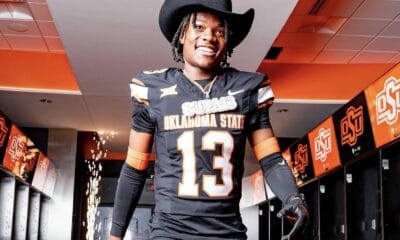
Four-Star In-State Target Israel Hammons to Announce College Decision Friday

Three-Star Safety Chayce Davis Commits to Oklahoma State

Oklahoma State a Finalist for Offensive Line Prospect Tristan Hardin-Roberts

OSU Softball: Mississippi State Transfer Pitcher Delainey Everett Commits to Oklahoma State

U.S. Open Preview: The Cowboys Will Be Well Represented at Shinnecock Hills

Daily Bullets (June 21): Cowboys Land a Pair of Power Four Pitchers

OSU Baseball: Cowboys Land Washington Pitcher Noah Kenney, Texas Tech Transfer Will Jordan

Wyatt Hendrickson Makes United States World Team

Daily Bullets (June 20): Eric Morris Reels in a Four-Star, Doug Gottlieb Extended

WATCH: Eric Morris Puts Three Oklahoma State Walk-Ons On Scholarship
-
 Football4 days ago
Four-Star In-State Target Israel Hammons to Announce College Decision Friday
-
 Football5 days ago
Three-Star Safety Chayce Davis Commits to Oklahoma State
-
 Football5 days ago
Oklahoma State a Finalist for Offensive Line Prospect Tristan Hardin-Roberts
-
 Softball2 days ago
OSU Softball: Mississippi State Transfer Pitcher Delainey Everett Commits to Oklahoma State