
Football
Pros and Cons of Oklahoma State’s New Football Uniforms
The OSU-Nike collaboration hit a home run once again.
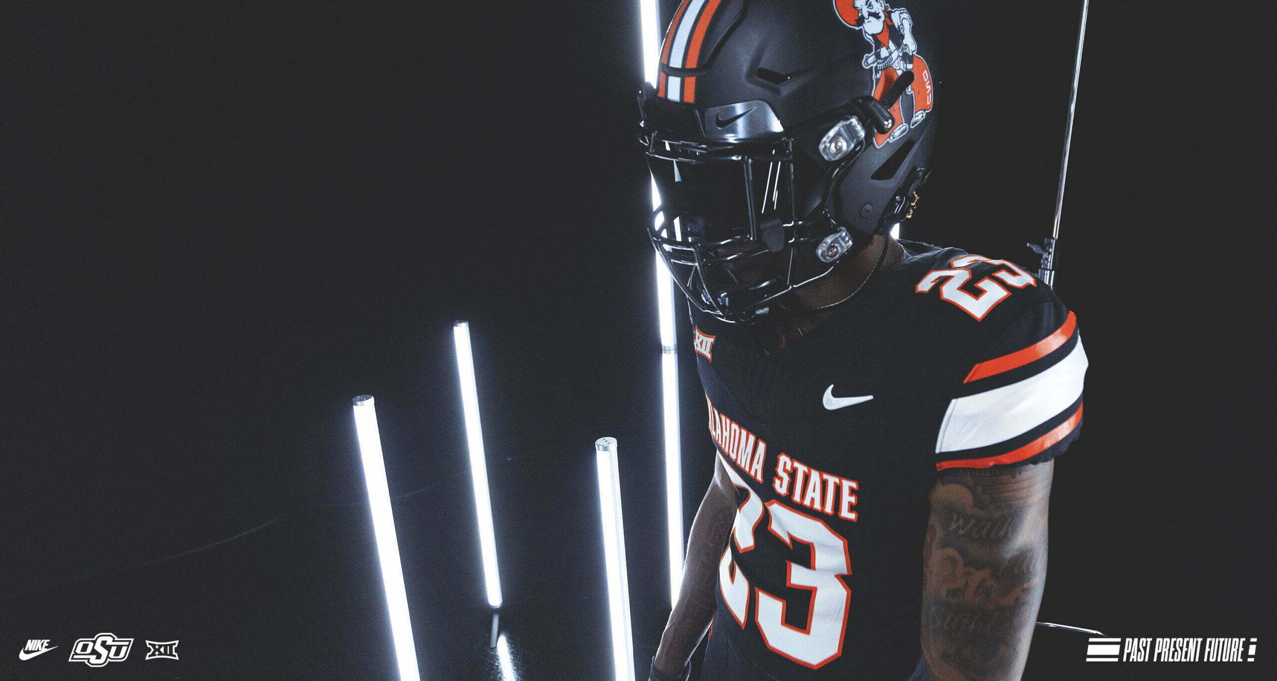
Oklahoma State released its new football uniforms on Wednesday, giving us a nice little gridiron dopamine hit before we drift off into the dog days of summer.
There will be ample time over the coming months (and years) to tear into the minutia of these threads, but I’m going to go straight kneejerk and throw out my Day 1 Pros and Cons of what I believe is the best kit OSU has unveiled in the Mike Gundy era.
Pro: Cleaner than 2016
The last time the Cowboys unveiled a new jersey design in 2016, I fawned over the new look. I ate up the cool little details that signified retired jersey numbers, university history and every other (non-barbed wire) element. But I softened a bit on this last outgoing kit the first time they dusted off the 2011 jerseys for a spring game. It wasn’t just nostalgia. After time to absorb it a little bit, I think the parts may have been greater than the whole. I missed that clean look.
If you don’t have a nostalgic fetish, you might view this new kit as plain. I do have one, and I find the cleanness (cleanliness?) refreshing and somewhat timeless. It offers a big-time college football program look with the cutting-edge versatility that the OSU-Nike collaboration has become famous for. (More on that below).
OSU also appears to have ditched the marshal badge, the barbed wire and some of those other elements which, while cool, became a bit distracting in the final product. This new design represents a nice amalgamation of previous iterations with a focus on nostalgia.
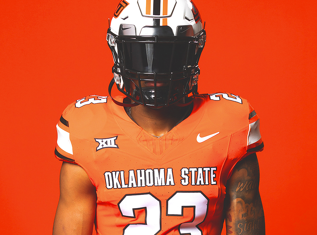
Pro: They Kept the Cursive
Threads will match lids!
Sign me up for the all-black with Cursive combo.
Based on released photos, OSU didn’t throw out the perfectly fantastic helmets that they’ve come up with over the last few years, including that gorgeous crossover cursive font.
Some of the other throwback helmets clashed just a tiny bit with the last kit. This new uniform appears to have been designed with them in mind, opening up even more possibilities for special edition getups. (More on that below.)
Pro: They Nailed the Mashup
Most agree that the best the Cowboys have looked over the last seven years have been the special edition throwback threads, commonly worn at homecoming. The people spoke and OSU listened.
Here’s a look at the 2018 Homecoming look compared to the new base look.
The Western-style font gives you just a hint of the 2011 uniforms, as do the shoulder stripes. They also sing with the striped helmet.
Just a tasteful update of the best-looking jerseys OSU has ever worn. If it ain’t broke, just enhance it.
As Marshall Scott pointed out on Twitter, a lesser design team could have tried to make this update more complicated than necessary when there was a layup just sitting on the rim. Instead, the team at OSU snatched it with two hands and threw down a rim-rocker that would have made Cam McGriff proud.
Pro: They Left Room to Play
As stated above, the inclusion of some of the better helmets fans are used to, as well as the option of two different away jerseys, this new kit allows for OSU to mix and match things nicely and more cleanly than in the last kit.
The throwbacks were an easy go-to for homecoming and other special occasions, but that just ups the ante for a design team that’s one of the best in the biz. I’m excited to see how they outdo themselves next HC weekend. They still have that vast catalog of special edition helmets, but I have a feeling that the equipment staff has something else up their sleeves.
Con: Gray is Gone
I don’t have many gripes about the new kit. In fact, this is not a gripe as much as it is my farewell ode to the most underrated uniform element at OSU over Gundy’s era.
I get it. It’s hurricane season and the island has been evacuated, but I will stand here on the shore alone missing the gray. Maybe that’s just nostalgic pining for the days of Josh Stewart housing defenses in head-to-toe gun metal. #Gonebutnotforgotten.
Overall, this uniform update gets an A+ from me. And who knows, maybe OSU will drop a gray 2011 throwback at the 20-year anniversary in 2031?


Way-Too-Early Prediction for Oklahoma State’s 2026-27 Wrestling Lineup

Tyson Pogi, Son of Aso, Commits to Play Basketball at Oklahoma State

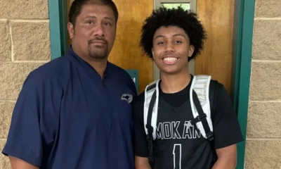
Dez Bryant Jr. Announces Oklahoma State Offer

OSU Baseball: Kollin Ritchie Makes History, Hits Walk-Off Home Run Against TCU

OSU Softball: Cowgirls Cruise to 7-0 Win on Senior Day, Lock Up 2 Seed in Big 12 Tournament

Daily Bullets (May 6): Cowgirls Racking Up Awards, A Different Offense

‘She’s Just A Dog’: Returning from Injury, Redshirt Freshman Madison Hoffman Has Provided the Cowgirl Offense with a Pinch-Hitting Spark

David Taylor Reveals that Dean Hamiti ‘Likely’ Won 2025 NCAA Title on Torn ACL

Daily Bullets (May 5): Cowboy Legend’s Son Gets an Offer, Pokes a Postseason Lock
Way-Too-Early Prediction for Oklahoma State’s 2026-27 Wrestling Lineup
-
 Wrestling2 days ago
Way-Too-Early Prediction for Oklahoma State’s 2026-27 Wrestling Lineup
-
 Hoops5 days ago
Tyson Pogi, Son of Aso, Commits to Play Basketball at Oklahoma State
-
 Football2 days ago
Dez Bryant Jr. Announces Oklahoma State Offer
-
 Baseball4 days ago
OSU Baseball: Kollin Ritchie Makes History, Hits Walk-Off Home Run Against TCU