
Hoops
Uni Debate: Cursive Cowboys or the 1995 Throwbacks?
A spirited debate over 1995 vs. 2000.
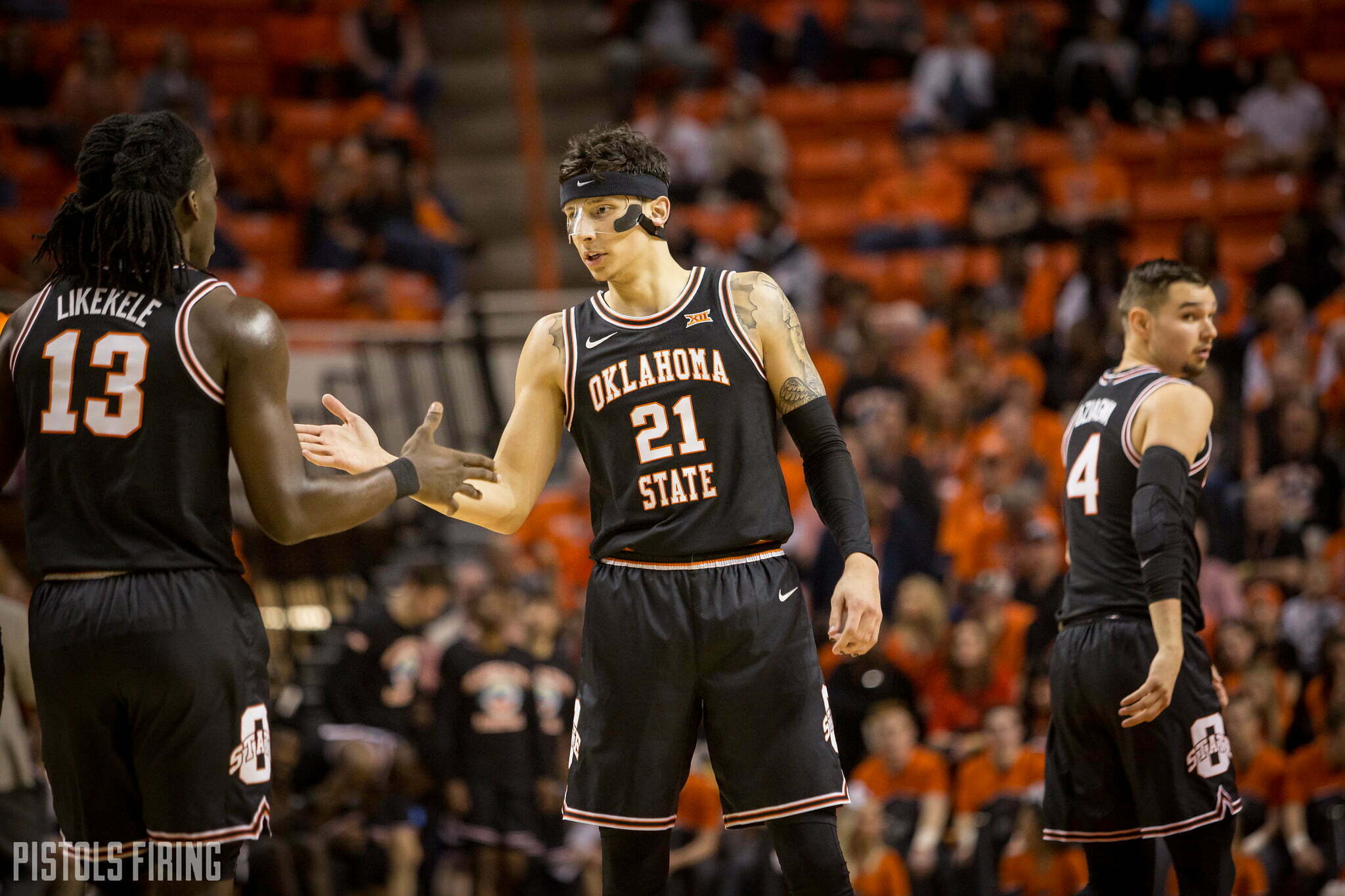
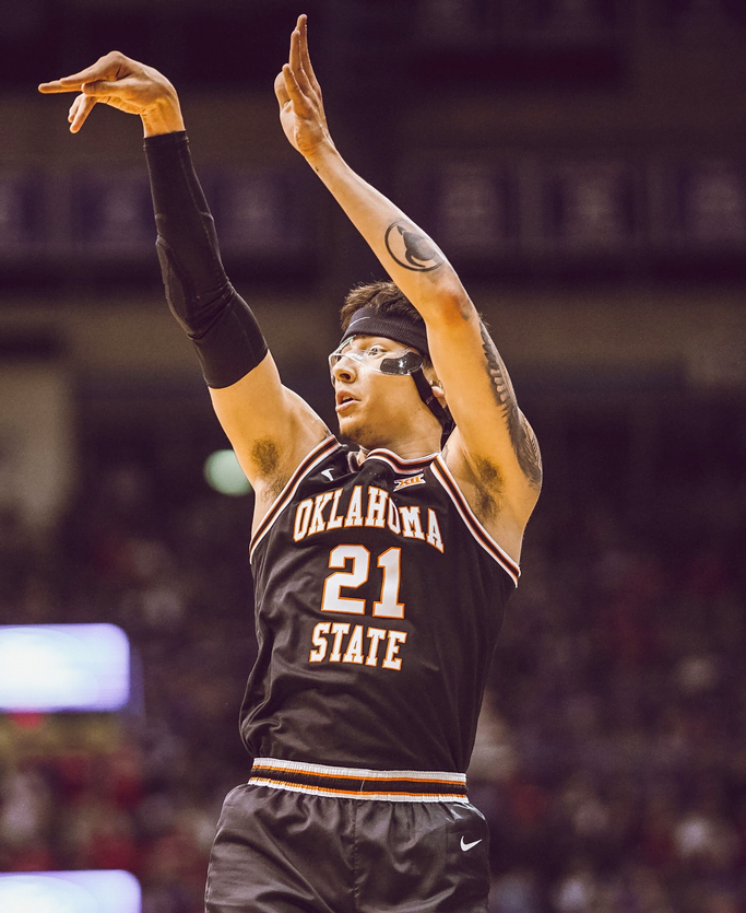
OSU is now 4-11 in the Big 12 which means it’s time to talk about which throwback uniforms are the best throwback uniforms. I (Kyle P.) will ride for the cursive Cowboys until I no longer ride, but I was on CC Island in this debate. Hope you guys enjoy.
Kyle Porter: Marshall, word on the street is that you think the 95 throwbacks are better than the OG cursive throwbacks. Explain yourself.
Marshall Scott: It’s all in the trim for me. Without the stripe it’s obviously a simple uniform. However after all of that black to quickly go white/orange/black/orange/white is a thing of absolute beauty.
Porter: You hate to see it. I will say the 95s were better than I thought they would be a few weeks ago, but the script is undefeated. You could start scripting stuff at McDonald’s and I think I’d actually start eating there (especially if they want to sponsor the Chamber).
Kyle Boone: I strongly (STRONGLY!) agree with Marsh. I’m team ’95 throwback > cursive Cowboys all day. I think the cursive Cowboys brings back too much nostalgia for you to make a fair and unbiased decision, KP.
Porter: Did they give you the drugs they gave your wife a few weeks ago @boone? Did you take them home?
Boone: I cannot confirm or deny.
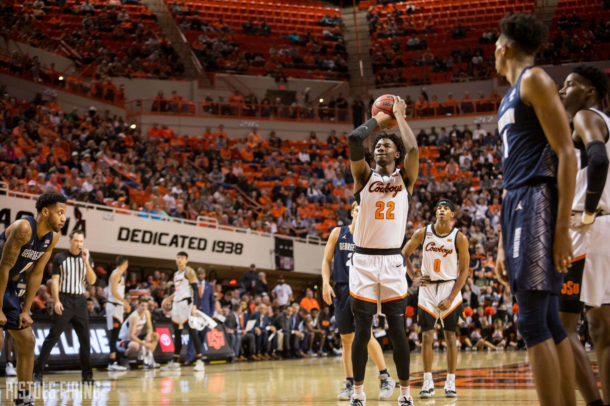
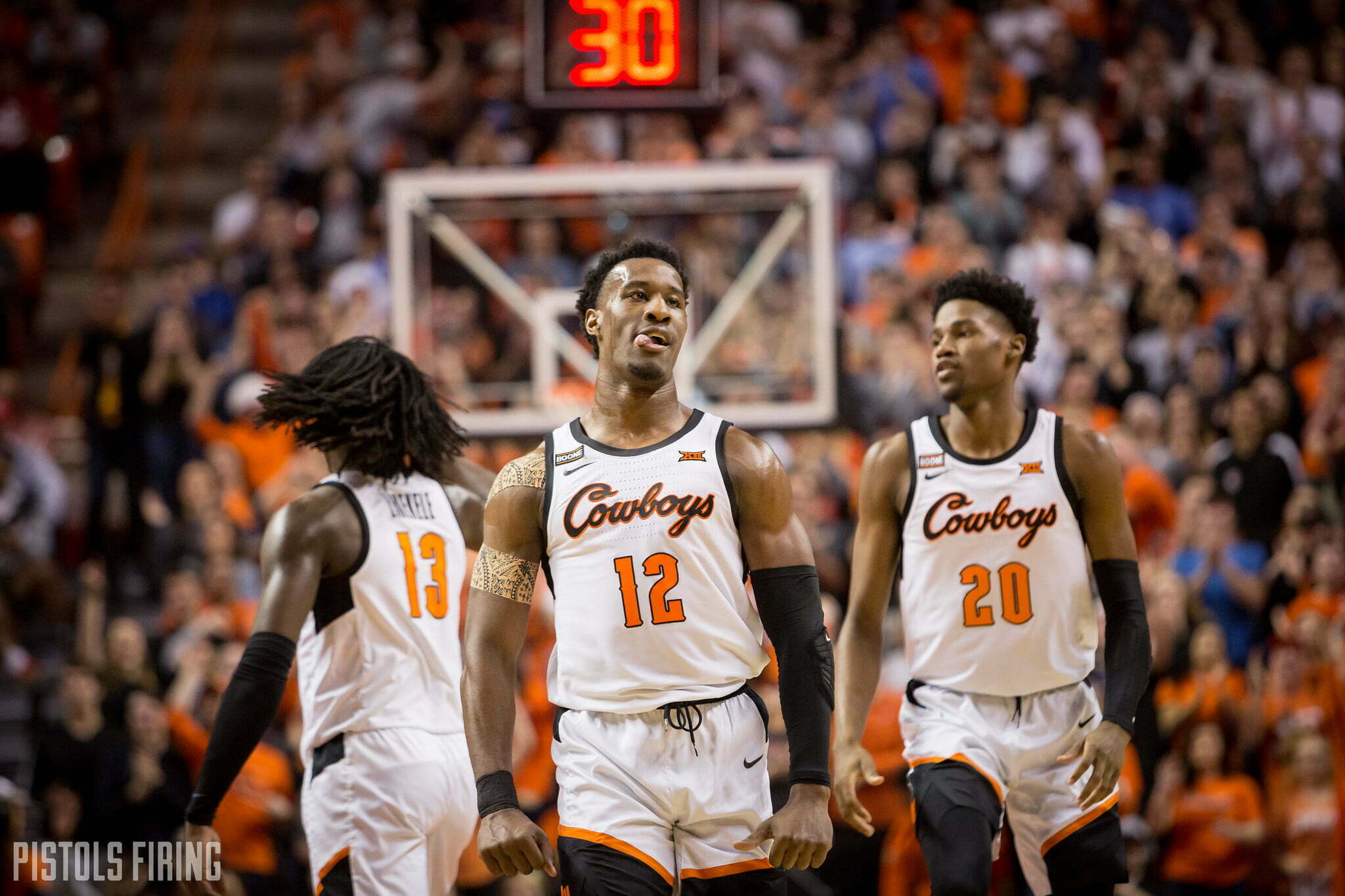
Scott: They’re a great uniform sure, but they just aren’t as good as those 95s. The best thing about the 95s is the shorts. Any interaction with Dustin Ragusa I’ve been in since the unis released has been Ragu asking if he can buy the shorts. You just don’t get that kind of love for the cursive Cowboys.
I’m also not even sure we’re comparing apples to apples here. A white version of the 95s might not work in current day. Would a black or orange cursive look pull off as well as the 95s? I doubt it.
Boone: The font of the numbers on the cursive Cowboys kit docks it a slight notch for me, too. They look gothic.
Scott: The number font looks like something you’d see on American Chopper. And again, I have no big issue with them.
Porter: Sounds like you do.
Boone: I think the 95s look more like legitimate throwbacks to me, too. The cursive Cowboys aged very well and look like a hybrid throwback/retro, but the multi-color outline bordering make them look old school and vintage. Me like.
Porter: The cursive shorts are underrated. They’re the only shorts I ever wanted in college. And while they 95 shorts might be slightly better (I am in pain admitting that), they’re not so much better that it overcomes the deficit created by the jerseys.
Scott: So here you are ready to admit that at least half of the 95s are better, how can I get you the rest of the way there? Obviously clowning the number font didn’t help. Do I need to send you a Bill Snyder letter all in cursive explaining that the 95s are better?
Porter: Type it on a typewriter and we’ll talk. The real question here is why in the world they would ever wear anything other than these two unis. Gray? No. All orange? Bedlam only. Make these two and the teals that recruits (and I) love the only threads you ever wear.
Boone: Underrated: look at the waist line on these! So good and neat.
Kyle Cox: #team95s.
Boone: There it is.
Scott: I think it’d be a little odd for a team to have to different styles as its main two unis, but I’m here for it.
Porter: It would be awesome.


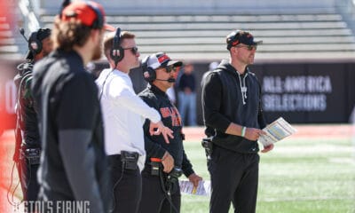
Eric Morris’ Coaching Staff Has More in Common with Contenders than Big 12 Newcomers

Player Rating Superlatives: A Look at the Fastest, Strongest Cowboys in EA Sports’ College Football 27

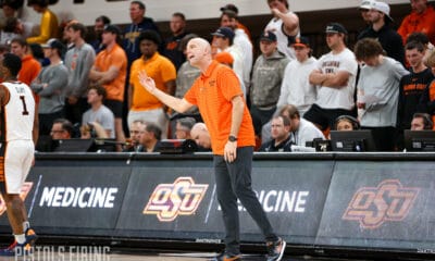
Steve Lutz Releases Statement on Kashie Natt’s Eligibility Pursuit

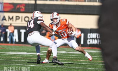
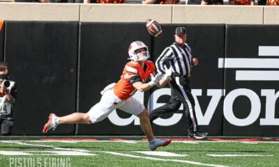
Oklahoma State’s Offense Well Represented on Big 12 All-Portal Team

Daily Bullets (July 1): Caleb Hawkins a (Preseason) All-American

Daily Bullets (July 5): Some Predix for OSU Football

Daily Bullets (July 4): Can the Defense Match the Offense, Happy 250th, America!

Texas Tech, Colorado Headline Big 12’s Top Defensive Portal Additions This Offseason

The Reload Ep. 53: World Cup Grass, Big 12 Media Days Preview

Daily Bullets (July 3): The All-Portal Pokes
-
 Football4 days ago
Eric Morris’ Coaching Staff Has More in Common with Contenders than Big 12 Newcomers
-
 Football4 days ago
Player Rating Superlatives: A Look at the Fastest, Strongest Cowboys in EA Sports’ College Football 27
-
 Hoops4 days ago
Steve Lutz Releases Statement on Kashie Natt’s Eligibility Pursuit
-
 Football3 days ago
Oklahoma State’s Offense Well Represented on Big 12 All-Portal Team