
Football
Ranking the Historical Oklahoma State Logos
From Barry’s OSU to the flaming flames, here are 20 OSU logos, ranked.
When Oklahoma State released its new (“new”) logo at the beginning of July, I got steep on a rabbit hole of old logos, and boy are there some good ones. According to this incredible, time-suck of a page, OSU has had 19 “marks” in its history, and the majority of them have been amazing.
Because this is an OSU blog and because it’s July, we obviously have to rank these from “OMG BRING THIS BACK” to “ok, maybe could have passed on that era.” Some of these are academic-only, and some are athletic-only. Regardless, I’m going to rank the ones that OSU includes on that page linked above and throw in the badge (which was not included?) along with them. Everything else is off the table.
Let’s jump in with probably (?) the consensus No. 1.
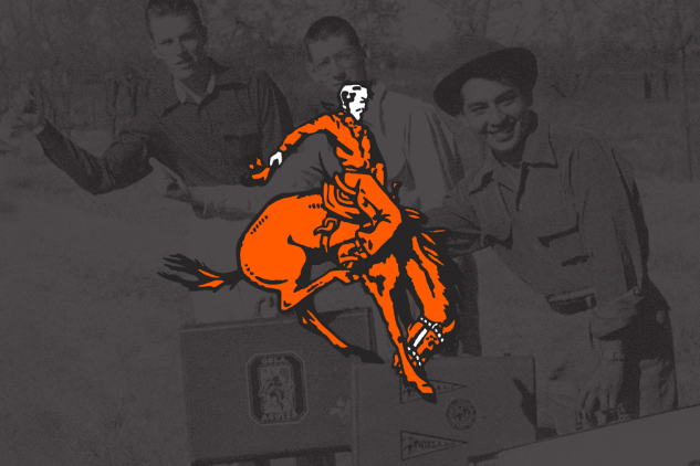
1. It is fitting that the best logo in OSU history coincided with the best athlete in OSU history.
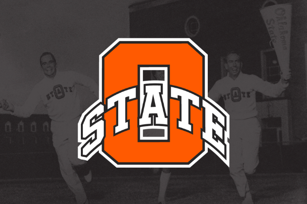
2. It’s perfect. Simple but unique. Distinguished but fun. Versatile and easy to recognize. I would actually be ok if they brought this back!
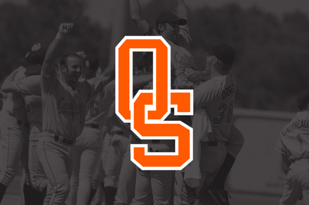
3. This was actually a baseball-only logo that started in 1978. Since then Oregon State has committed many acts of theft it went away until Josh Holliday brought it back when he became the head coach. It’s tremendous.
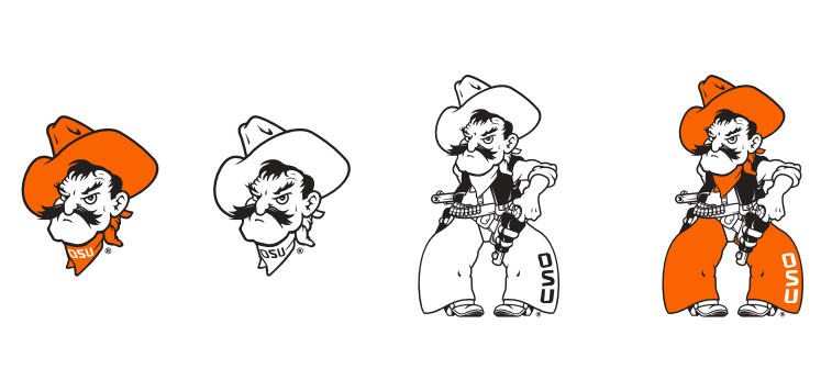
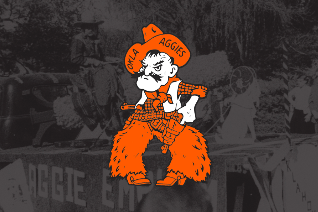
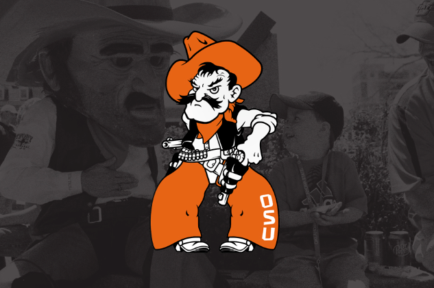
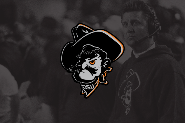
4. This is maybe the best logo for football helmets. I realize that’s a very specific niche, but it’s true! This logo debuted when OSU flipped from being the Aggies to being the Cowboys in the late 50s.
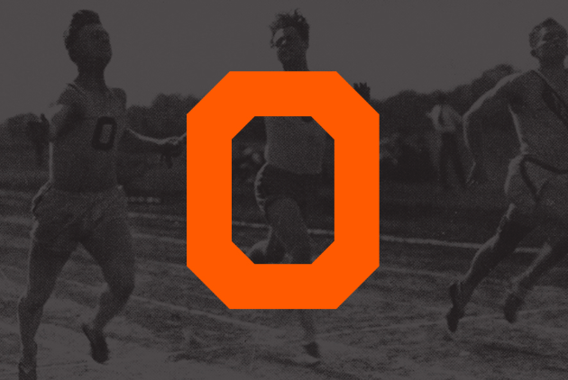
5. The first logo. I’m a sucker for anything simple like this. If they ever use this on the Homecoming throwback helmets, I’m going to need CPR in the press box.
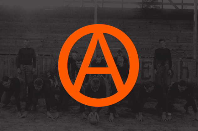
6. The best mark, non-letter division.
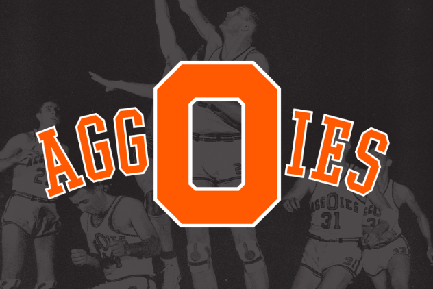
7. I like this one a lot from a uniform perspective, but there’s a lot going on. And it’s maybe a bit too easy for opposing teams to insinuate that spelling is not OSU’s strongest suit.
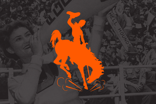
8. This is the rougher, not-quite-as-cool version of the bucking bronco above (interestingly, it actually came after the one above). Still strong, but just not all the way there yet for me.
9. I don’t know that I’ve ever truly loved Regular Pete the same way I love Wrestling Pete or Swinging Pete or Baseball Pete, but I do love this version more than the modern one.
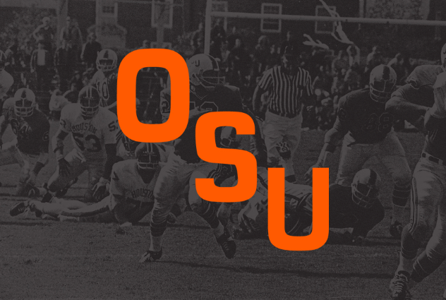
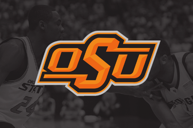
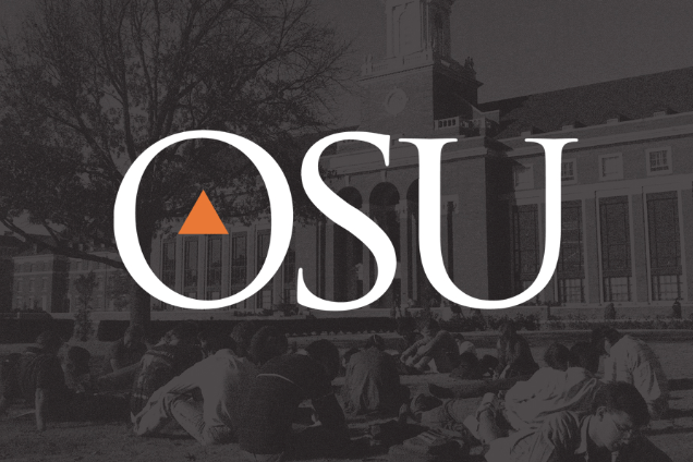
10. The new logo checks in at No. 10. I think it’s pretty good. I have an affinity for a lot of the older stuff, but they’ve done a good job here melding a modern look with an older, simpler version.
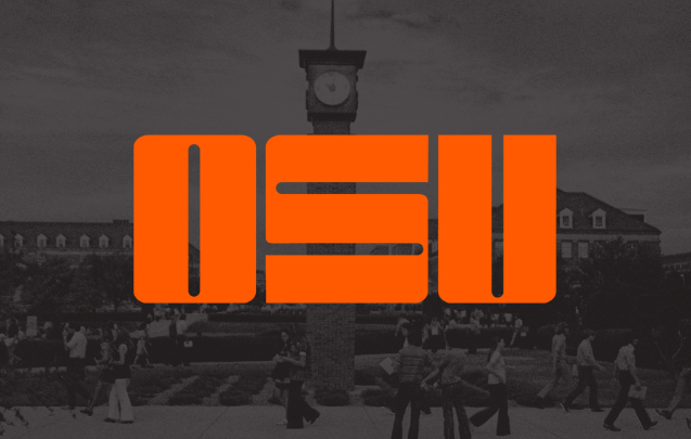
![]()
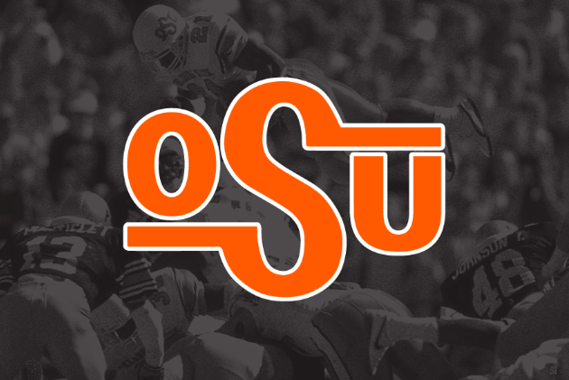
11. Tough for me to put it ahead of the brand because, you know, it includes the brand. But I love its versatility and how OSU uses it. Subscribed!
12. I like it, but there is a LOT to look at.
13. This was the logo on my third-favorite basketball court GIA has ever housed.
14. It’s good, solid and more importantly has led to the Other Petes I noted above.
15. Taking away the beveled (I think that’s what they’re called) edges on the letters was a [chef’s kiss] move here.
16. There is no logo in recorded college history that screams “1970s!” more than this logo screams 1970s.
17. Sure, it’s fine. But I prefer the 1940s Pete (see above). This one really is all right, it just seems a little bit too contrived for me [goes outside and shakes fist at clouds]. Also, these last three are pretty rough.
18. This one was academics only (thankfully).
19. Tough scene here. It was a good effort, and here’s what OSU said about its introduction to the 2000s.
Coinciding with the renovation of historic Gallagher-Iba Arena, Oklahoma State Athletics underwent a major rebranding effort in 2001 with the introduction of a more modernized system of marks. This updated O-State logo represented the school’s various academic organizations. [okstate]
Gonna be a hard pass for me.
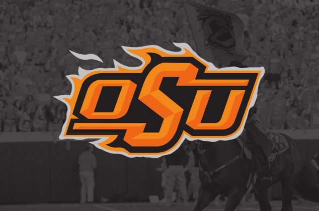
20. The thing that maybe offends me most is that Rickie Fowler had this logo on his golf bag until like 2018! Also, I laughed out loud at the description from our friends at OSU.
The burning brand was a shorter-lived variant of the modern OSU logo. Although the mark was popular with children and younger audiences, it failed to gain traction among alumni and older fans and was gradually phased out of use. [okstate]
The burning brand had to be burned.


‘Hell Yeah I’m Still Interested’: How Jacie Hoyt Built Oklahoma State’s Best Portal Class in the Country

Eric Morris Has More Returning Talent Now Than He Had Ahead of UNT’s Dominant 2025 Season

Big 12 Quarterback Tier List: Get to Know the League’s Quarterback Situations

Where Oklahoma State Is Projected Going into the Big 12 Tournament

In-State Speedster Cooper Hooker Commits to Oklahoma State

Daily Bullets (May 23): Tough Day on the Diamond, Pokes to the Middle of the Pack?

OSU Softball: Cowgirls Drop Game 1 of Lincoln Super Regional

Football Recruiting: Oklahoma State Makes Top 5 for Four-Star Athlete, Defensive Staff Visits In-State DB

The Reload Ep. 48: Is a 24-Team Playoff a Good Thing?

Daily Bullets (May 22): Cowgirls Postponed, Pokes Advance
-
 Hoops5 days ago
‘Hell Yeah I’m Still Interested’: How Jacie Hoyt Built Oklahoma State’s Best Portal Class in the Country
-
 Football4 days ago
Eric Morris Has More Returning Talent Now Than He Had Ahead of UNT’s Dominant 2025 Season
-
 Football3 days ago
Big 12 Quarterback Tier List: Get to Know the League’s Quarterback Situations
-
 Baseball4 days ago
Where Oklahoma State Is Projected Going into the Big 12 Tournament